This week will mark the 18th year of existence of wiskate.com. Eight years ago I wrote a history of the site for the 10 year anniversary. This is an updated and expanded version of that post. ~Josh
Wiskate.com over the years (click images for a larger version):
1998: We’ll have to call this one an “artist’s re-creation” since I haven’t been able to turn up a copy of the first version of the site. The text is the real “hello world” first update that I found in an “old news” html file in an old folder. So shy, so wide eyed. Note the sweet Hi8 video grab inserted into a faux film sequence of Nate Heilberger doing a noseblunt in what was a little private skate zone in a warehouse in Racine. Photoshop 3.0 surely had some great filters. That isn’t the actual 1998 header, and I really don’t remember what the original logo did look like. Probably horrible and dumb.
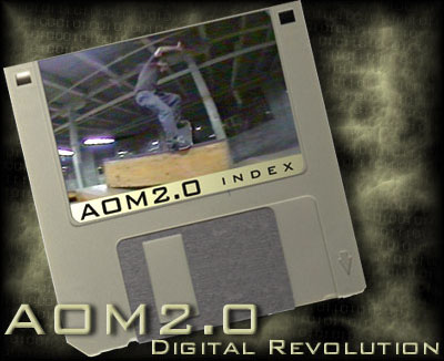
1999: Above!: the perfect example of the essence of Photoshop pre Y2K. The extreme horniness for bad filters can never again be matched. Again, a video grab of Nate noseblunting. Pasted onto a goddamn faux floppy disc label! My mind is blown. The tan fog and “100100100101001” (digital, get it?!) in the background are just icing on the early internet cake. It’s really something else, so lovely.
2000: I think this was the very first thing that appeared on the wiskate.com URL. A placeholder from when I moved the site from it’s original, not so easy to remember address, to the much more serious real domain name. It was sort of a big deal to have a registered domain back then. At that time it cost $35.00 a year to register a domain! Again, note the sweet Photoshop 3.0 filter action. At least I didn’t apply a lens flare.
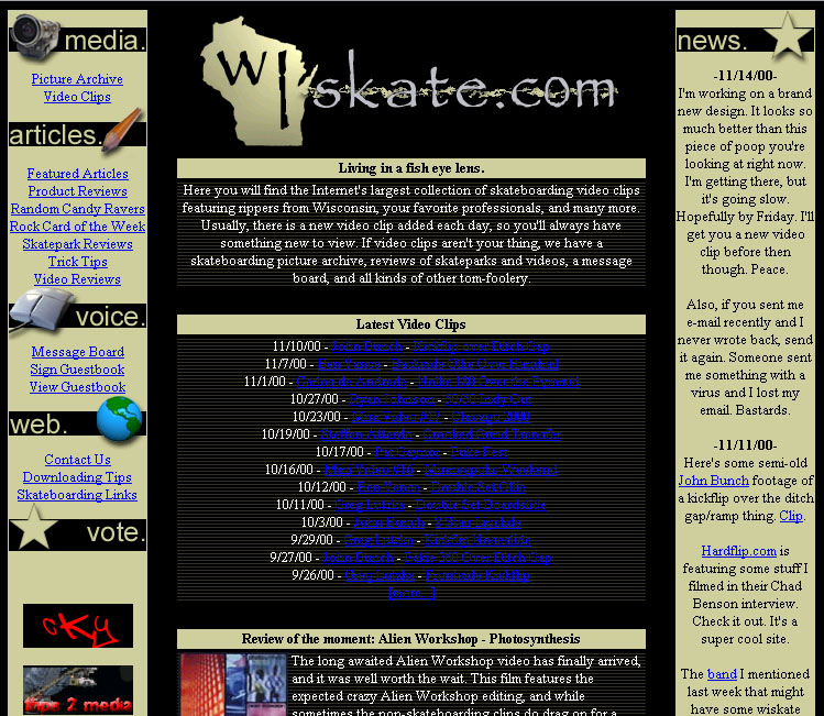
2000: It seems I kept the tan fetish alive after I redesigned the site for the new address. If I wanted to pat my back a little, I’d say this design is actually pretty nice for the time. Notice how often video clips were added. I must have had much higher stamina at that young age. The little banner ad to the CKY site (I think we traded links) certainly is a nice touch.
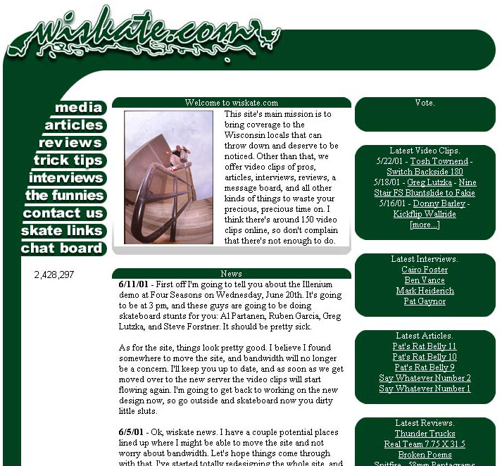
2001: The ever so lovely “jizz logo” era. This is when the site was at its peak of popularity, mostly due to the fact that there actually weren’t many skateboarding websites on the internet at all at that point. Sites with video clips were even rarer. Thousands of people a day were visiting the site.
Around this time is when I started filming with Greg Lutzka a lot, also Ben Vance was really getting a lot better, and I met and started filming with a lot of other good Milwaukee dudes. I got my first (and only, I still use the same one) 3 chip video camera so the quality of the video clips was much improved and traffic kept increasing. In fact, it got so popular that we were kicked off our host and were m.i.a. for awhile while I figured the situation out.
I ended up hosting the video clips on a different server for a site that posted video of live shows of indie and punk bands. Soon after we started hosting clips there, they lost interest in working on their site and gave up on it. I had only paid them once for the hosting at this point. Their server did stay online in an abandoned state for several years afterward and they never again asked me for money. Bonus!
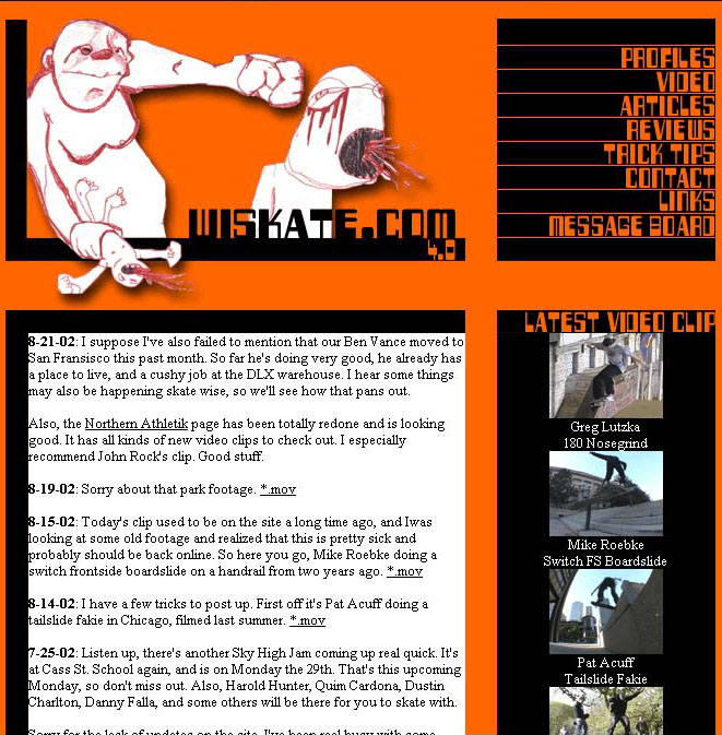
2002: As soon as I saw the baby punch in Nate’s sketch book I knew that it had to be used for a new layout. I’m not sure what’s up with the Halloween year round color scheme, but those were much scarier times. I think this is when I got more serious about trying to make a video and I wanted to save the good clips, so this is when the neglect started.
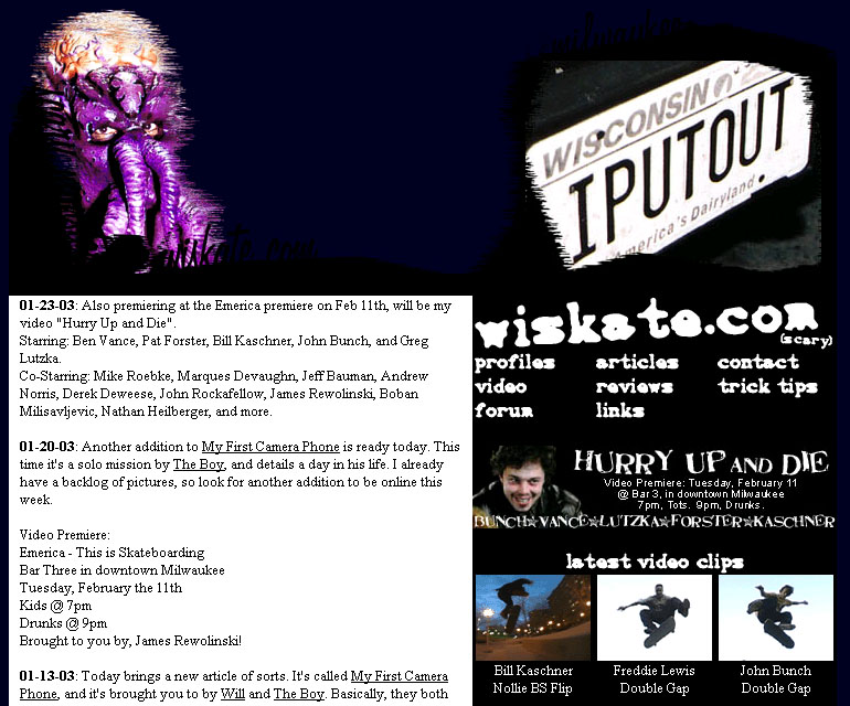
2003: Speaking of scary times! I had almost forgotten about this layout, no trace of it exists on my computer and I think it was used for less than a year. The little banner and news update for the premiere of my first full length video “Hurry Up and Die” is a nice piece of nostalgia. The “I PUT OUT” license plate still blows my mind to this day. I’d still see this car around for at least a decade after I had shot that photo.
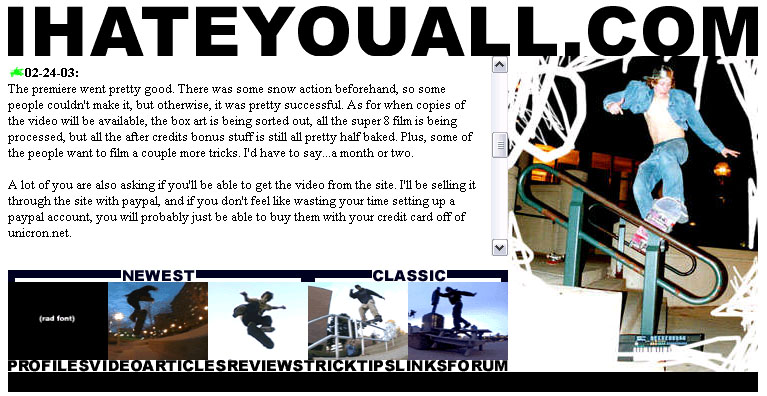
2003: Here we have the evolution of several (thankfully) unused layouts into…
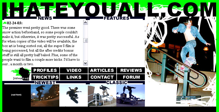
2003: …this stupid thing. Some of you may remember this quite well as it was used for three, maybe even four years. In fact, some remnants of this layout still were used in some of the backwater sections of the site for many years after the main areas of the site were updated. I wanted it to be as obnoxious as possible and I think I succeeded because it bums me out just to see it. This layout represents the ups and downs of the site quite well. It featured times of updates several times a day, and also periods of no new stuff for months. Most of those updates were just non-skateboarding nonsense, but a little bit of shredding related stuff did sneak in there once in awhile. The site wallowed in this disgusting mess of a layout for way too long.
This also marks the first version of the site that had a CMS and could handle contributions from several users. All the updates from this period, god knows why, are still available on the current version of the site.
2004: Cell phone cameras were the new gadget on the scene, and a few people in the crew had recently obtained such devices. The phones were able to send their relatively low-res pictures via email to other phones or computers. I wondered if it was possible to write some kind of program to check an email address and automatically copy the image to the server and post it with no human intervention. This was unheard of at the time, nothing was automated like that. I’ve never been a great programmer, but through much trial and error I was able to get things working. Basically, if you knew the ‘secret’ email address and had a picture phone from Sprint, you could post to the Moblog. Kind of like a 2004 version of Instagram. In the end, throughout its existence, around 1,000 photos were ultimately posted to the Moblog by roughly 10-15 users.
I actually uploaded and temporarily got the Moblog working to obtain this screenshot, the 8 pictures shown were the first 8 ever uploaded. They look so crappy because I didn’t know how to make a thumbnail from the original image and retain any amount of quality. I eventually figured that out, not that the pictures looked great in the first place.
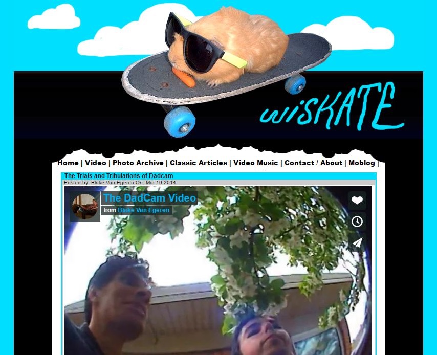
Mid 2000s: This was the last layout of the site before we switched over to the current WordPress version. Most of the content switched to “blog style”, by that I mean there was no longer any archive of photos or videos where you could locate everything in one place. All of the content remained within a blog post. While it kept everything easier to update for the various contributors, it also made all of the content much more disposable. The design stayed around for a long time, did what it needed to do, and looked stupid. All of the posts from this era were also moved over to the current version of the site.
Our buddy Jeremy Pettis made several headers for this version of the site over the years.
February 2012: Quite honored to have this very blasé interview appear in Thrasher Magazine!
In conclusion: That brings us up to date with the various versions of wiskate.com over its 18 year long existence. How long we’ll keep it up, god knows. We certainly don’t know when to quit.
I don’t have any screen shots of the various versions of the message boards that were on the site over the years, and for that I am thankful. That level of stupidity deserves to be forgotten.
Thanks to all the contributers over the years! Without you, maybe we would’ve actually quit!










Comments
5 responses to “18 Years of Bad Layouts and Inept Photoshopping”
Bring back the message board!
-Bitch
That’s not nice Willy
Coulda been a billionaire with your early Instagram program.
At least I’m rich in “gorf dollars”, what more could a man ask for??